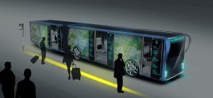
Buses aren’t particularly attractive. Slab sides and hacked-together advertising make them rolling blights in the urban landscape. So what if you could change the design on a whim, provide useful information to travellers, and make some extra scratch for the city? Tad Orlowski’s Willie Bus does just that.
Using transparent LCD displays coating the entire exterior, municipalities can project almost anything on the screens. And it looks a lot better than some slapped-together ad for a local ambulance chaser.
So, part mobile billboard, part rolling information center, with route planning, weather reports, news coverage, and anything else a commuter or tourist could want splashed across the displays. And since they’re transparent, riders can see out, while outsiders can’t see in.
Toyota has played with similar transparent displays on its FV2 and Fun Vii concept cars, and the Willie biggie-sizes it. But like the Toyotas, it’s just a concept, and we somehow doubt those organic structural arches and massive slabs of glass would pass a crash test. But we can get behind anything that spruces up the cityscape.
BY DAMON LAVRINC, 12.12.13′ 3:09 PM.
See Concept Video
https://crystal-display.com/components/displays/transparent-displays/
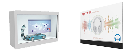
Let us know your ideas and concepts for Transparent Displays in the future?
https://crystal-display.com/digital-signage/clearvue/
.


